
Modifying Fonts
I've got a website for my company and I wanted to have a nice font that matched my logo. But it doesn't have any special characters in it! Lets fix that ...
I was quite happy with the D-Din font for the headings on my website, but I didn't realize at the time is that D-Din (https://www.fontsquirrel.com/fonts/d-din) doesn't have any special characters on it!
So the simple answer was just to extend the original font with the characters I needed. It has an SIL Open Font License v1.10 which allows modification so long as the license is included in the metadata, so we're OK on this front. I decided to use FontForge.
Step 1: Setup
First, I grabbed FontForge. I'm on Linux, so I just used the AppImage. There's also versions for Mac and Windows.
Open FontForge and load your font file. I opened the D-DIN bold font and opened the `Metrics -> New Metrics Window` to be able to see the letters next to each other. typed in the letters I was intending to change, along with their English counterparts so that I could compare them.
Just be conscious that if you drag letters around in the metrics window it makes changes to the fonts, so be careful not to do that unless you intend to alter the kerning!
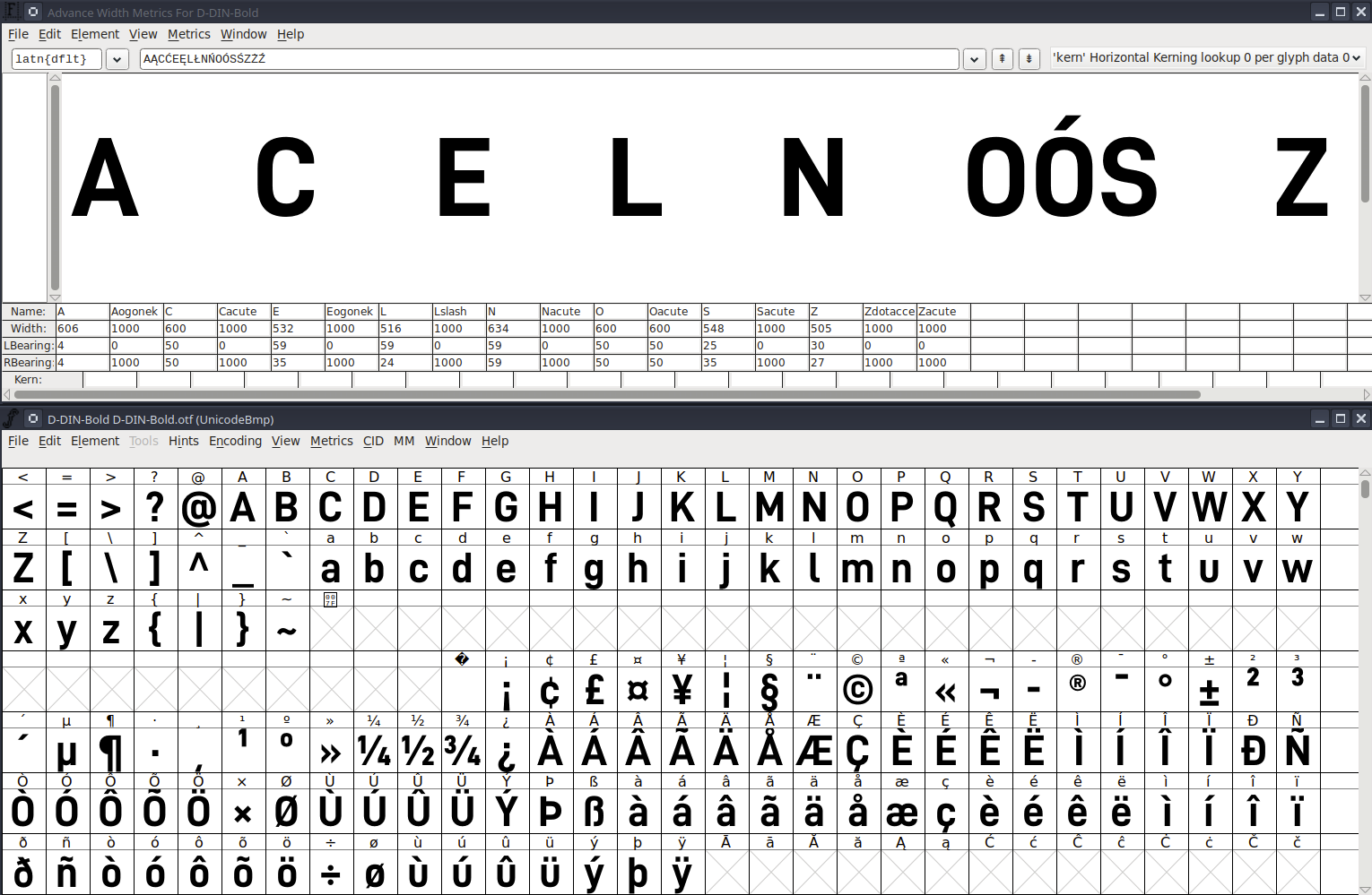
You'll notice in the screenshot above that all the Polish characters entered in the top line are not displaying. This is what we want to correct!
Step 2: Copy Base Letters
For me, I'm working with Polish letters, but depending on your language you will do something similar. If you don't have any base letters that are at least similar/close to what you want, then you'll have to make your own splines from scratch (it's not as bad as it seems though!)
In the window with the D-Din fonts, select and copy the base letters (in this case A, C, E, L, N, O, S, Z, Z) and paste them into Unicode slots:
- A → Ą (U+0104)
- a → ą (U+0105)
- C → Ć (U+0106)
- c → ć (U+0107)
- E → Ę (U+0118)
- e → ę (U+0119)
- L → Ł (U+0141)
- l → ł (U+0142)
- N → Ń (U+0143)
- n → ń (U+0144)
- O → Ó (U+00D3)
- o → ó (U+00F3)
- S → Ś (U+015A)
- s → ś (U+015B)
- Z → Ź (U+0179)
- z → ź (U+017A)
- Z → Ż (U+017B)
- z → ż (U+017C)
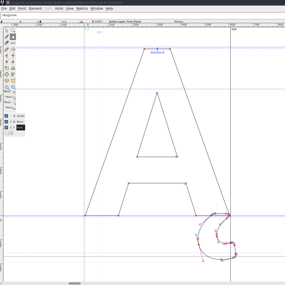
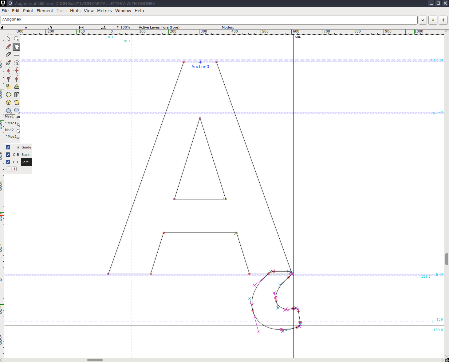
Step 3: Add Diacritics and/or Adjustments
Now you'll want to double-click on the letter you adjust to open the glyph editing window and make/add/adjust the spline or splines that makes it into the special character you want
Keep this handy so that you can copy/paste it if it occurs in multiple places.
Dragging things around is somewhat frustrating, but if you highlight all the points on the spline you can use the keyboard to adjust the positioning.
Another option is to copy/paste individual glyphs from another font with compatible licensing, but this is beyond the scope of what I'm doing here. It was my first exploration but its challenging to find fonts that are truly "compatible" with each other visually.
Then check it in the metrics to see if it makes sense or if the kerning is now slightly off (in this case it's slightly off because the ogonek goes a bit further to the right than the original letter).

You can adjust the RBearing in the menu at the bottom in this case to keep the proper kerning.
Finish it up for the rest of the letters!
Step 4: (Update!)

So it turns out I didn't know about this step when first doing the fonts, and I learned the hard way. After adding the letters, there's a few more things you have to do to ensure that all the fonts render properly. I spent a lot of time trying to figure out why I had a "cursed" Ą, but through all my debugging actually fixed other issues as well.
Removing Overlap
When you add an ogonek or other symbol (like the slash in Ł), the new contour overlaps with the base letter and this is actually not acceptable. However, the fix is very simple - open the glyph in the glyph editor and run Element/Remove Overlap (Ctrl+Shift+O) which merges the outlines to a single one.
Add Extrema
There is an expectation that on-curve points are at the very top/bottom/side of every curve. Otherwise hinting/rasterization could change as the size changes. But this is also an easy fix, run Element/Add Extrema (Ctrl+Shift+X) on the letters and this will modify them automatically
Fix Hints
Another easy fix in my case, just regenerate them with Hints/AutoHint.
Fix Mark Positioning
This one took a lot of time to figure out - after I added the letters, FontForge had Ą and ą as mark glyphs in the GPOS Mark Positioning Table. I'm not sure if this is because I copied the ogonek mark or if this was an artifact of the table from whatever file D-Din used as its template. This would result in them being special marks that would attach to the previous letter, instead of being standalone characters. But only certain letters, in order to ensure it was hard to figure out!
The fix was going to Element/Font Info/Lookups, opening the GPOS tab, then expanding the Mark Positioning lookup subtable. Click edit data and remove them from the list.
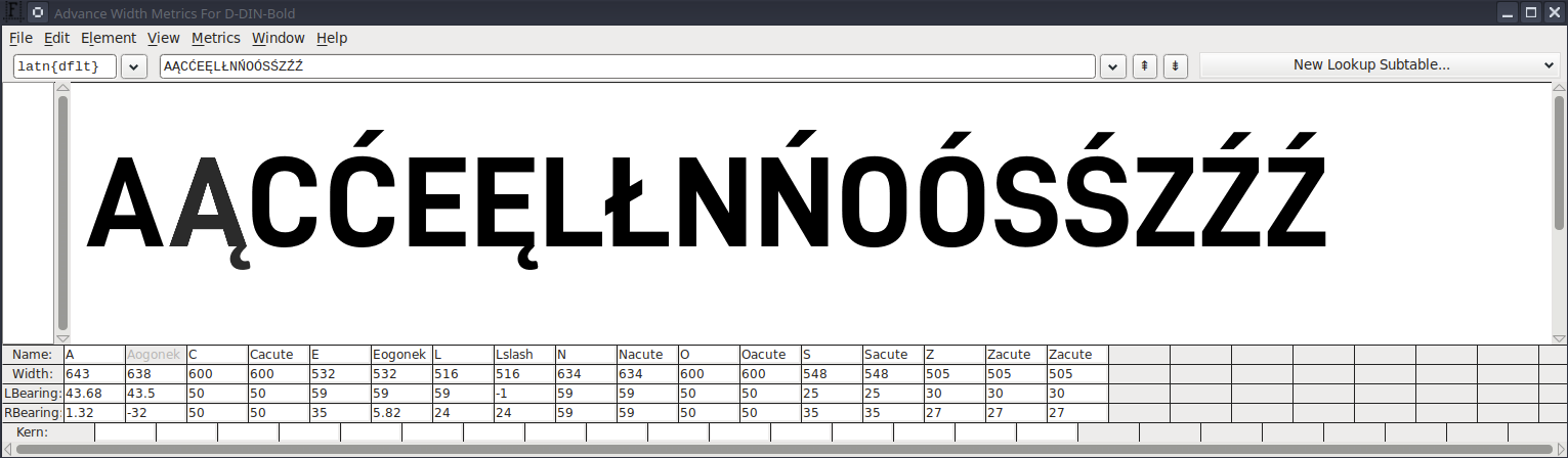
More Kerning Spacing Things
So perhaps unsurprisingly, the kerning spacing was a lot more complicated than I originally realized. The original font had kerning classes so that AĄÀÁ and so on are all one class because they're all roughly the same shape and so should have the same spacing relatively to other letters. However, when adding our letters we have to manually add them to these classes, otherwise specialty spacings don't get applied!
- A class: add Ą
- a class: add ą
- C class: add Ć
- c class: add ć
- E class: add Ę
- e class: add ę
- L class: add Ł
- l class: add ł
- N class: add Ń
- n class: add ń
- S class: add Ś
- s class: add ś
- Z class: add Ź, Ż
- z class: add ź, ż
This has to be done for both the First Char and Second Char sides for every kerning class subtable across all the kern lookups. There was like 70 to update ... maybe someone knows an automated way the next time
We also identified a couple of issues we didn't like with the baseline font that became more apparent since we were this deep in the rabbit hole. The Z to A kerning we reduced from -80 to -25 because they were overlapping (or perhaps this is something I messed up myself earlier on?), and the H to A/E/O classes needed a slight decrease in distance from 0 to -8 to feel correctly spaced with the other letters.
It was a lot more work, but maybe this can help you when debugging why your font isn't spacing right!
Step 5: Generate the Font
- Go to `File -> Generate Fonts` and choose "OpenType (CFF)" (.otf format) and save it to your PC
- Upload the font to Font Squirrel's Webfont Generator
- In the webfont generator, make sure to choose expert mode and select "No Subsetting" (You can also do subsetting to choose the proper language support, but this is simpler). If you don't do expert mode and choose no subsetting, then the original subset will be the only letters exported!
- Download the webfont kit .woff2 and .woff files
- Now the font (or whichever language you are using) supports the letters and is consistent with the original styling!
- If you're not using it on a website, you can just use the .otf format directly in something like a word processor and skip steps 2-4.
You can see it in use on my company's website
And that's it!